Refining Layout Strengthens My Magazine Pages
Completing the final revision of my magazine pages was a challenging but rewarding part of the design process. As I refined my layouts, I learned that good design isn’t about starting over it’s about making thoughtful adjustments that improve clarity and visual flow. Each revision helped my magazine pages feel more intentional and professional.
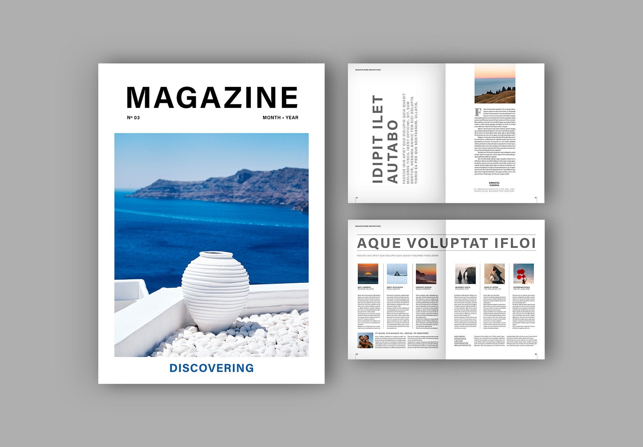
One major change I focused on was spacing. In earlier drafts, some pages felt crowded, which made them hard to read. By increasing margins and adding white space, my layouts instantly felt more balanced. Professional magazines don’t try to fill every inch of the page instead, they use space to help the reader focus on what matters most.
I also paid closer attention to alignment. Small misalignments can make a page look messy, even if the content is strong. During my revisions, I carefully lined up text boxes, images, and captions. This simple adjustment made my pages feel more organized and visually pleasing.
Another key part of my revision journey was improving consistency across all four pages. I made sure fonts, colors, and heading styles stayed the same from page to page. Professional magazines rely on consistency to create a recognizable look, and applying this principle helped my magazine feel unified rather than random.
Finally, revising my pages taught me the importance of stepping back and evaluating my work. Looking at my layouts as a reader not just a designer helped me notice what worked and what didn’t. Each revision strengthened my confidence and showed me how design choices directly affect communication.
This process showed me that layout and design are not just about creativity but also about problem solving. By refining my magazine pages, I developed skills that will help me create stronger, more professional designs in the future.


Comments
Post a Comment