Professional Magazines Inspire My Design Choices
As I worked on the final revision of my magazine pages, I spent a lot of time studying professional magazines for inspiration. Looking closely at real publications helped me understand how layout and design choices affect how a reader experiences a magazine. Instead of just placing text and images wherever they fit, professional designers use structure, balance, and intention to guide the reader’s eye.
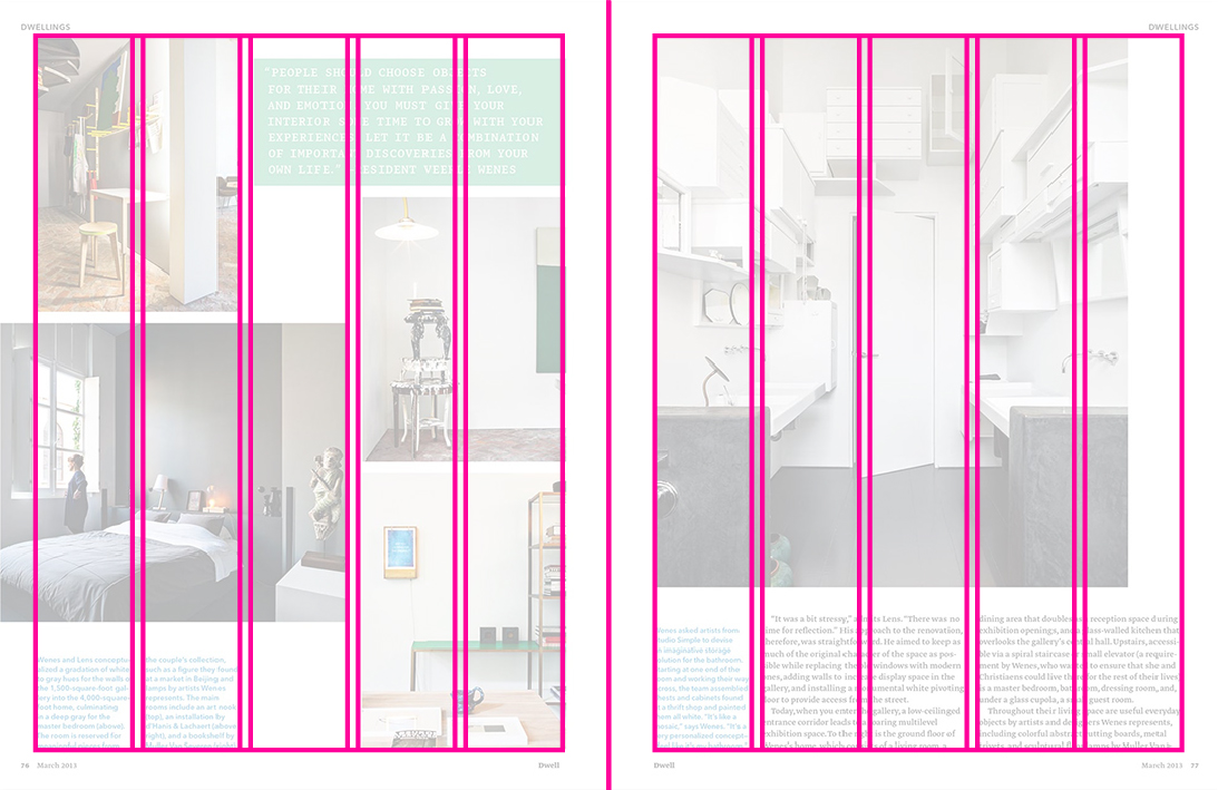
One of the first things I noticed was the consistent use of grids. Most professional magazines rely on columns to keep text organized and readable. When I applied a grid to my own pages, my layouts immediately felt cleaner and more professional. The grid helped me line up headlines, body text, and images so everything felt connected instead of scattered.
Another important design element I observed was that professional magazines use different font sizes and styles to clearly show what information is most important. Headlines are bold and eye-catching, subheadings break up sections, and body text remains simple and easy to read. While revising my pages, I adjusted my font choices so my headlines stood out more and my body text felt less overwhelming.
Images also play a huge role in professional magazine design. Instead of randomly placing photos, designers carefully size and position images to support the text. Some spreads use full-page images to create impact, while others use smaller photos with captions to add detail. I realized that my earlier drafts didn’t give images enough space, so I revised my layouts to let visuals breathe and grab attention.
Overall, modeling professional magazines helped me think like a designer instead of just a student completing an assignment. By studying real examples, I learned how layout and design choices work together to tell a story. This approach made my final revisions stronger, more polished, and closer to what readers expect from a real magazine.


Comments
Post a Comment